The idea
Your BeAware dashboard is one live picture of what is happening around an address you care about. The map shows where events are, the tabs sort them into plain categories, and the status bar up top tells you at a glance whether your area is calm or worth a closer look.
Reading it, top to bottom
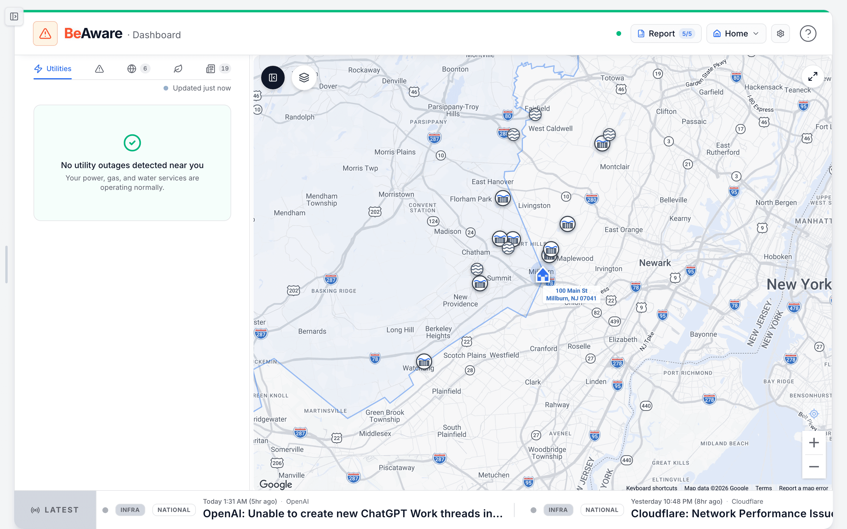
- Open this address's full risk report. The count is how many fresh reports you have left this month.
- The address you are watching. Tap to switch saved locations or add a new one.
- Pick what you are watching: outages, emergency, digital, environment, or news. The number is how many.
- The ticker: breaking local alerts and headlines for this address, scrolling along the bottom.
- Start with the status bar. The top row carries the BeAware wordmark, a green pulsing "Live" indicator, and a risk status with a colored accent line. Calm states stay quiet; an elevated state adds a short description and a "N nearby" count. On the right you will find the location chip (your active address with a home marker), an air-quality chip when air is worth noting, a "Report" shortcut to your baseline report, and a settings gear.
- Switch locations from the location chip. Click your address to open "Your Locations." Each row has a monitoring switch and a bell, a label and street address, and a "..." menu to edit, regenerate the report, make primary, copy the address, or delete. "Add location" lives at the bottom, and the strip below shows how many locations and reports you have used this period.
- Open your baseline report from the "Report" pill. It carries a small counter showing regenerations left this month. While a report is building, this spot becomes a progress bar. If the last run failed, it turns into a red "Retry" button.
- Move across the five tabs. They read left to right as Utilities (power, gas, water outages), Emergency (FEMA and NWS alerts plus actionable air-quality warnings), Digital (internet, cellular, cloud outages), Environmental (rivers, wildfires, dams, air quality), and News (local safety stories). Each tab shows a count, and a tab turns red with a pulsing dot when something inside needs attention now.
- Sort within a tab. On Utilities you get three buttons: Distance, Affected, and Recent. Tap one to sort by it, then tap the same button again to flip the direction (arrow up or down). The defaults are nearest first, most affected first, and newest first.
- Read an outage card. Each card opens with a status badge (new or ongoing), the utility name, then how many are affected and the estimated time to restore, shown as "N affected, ETR ~Xh Ym." Below that is the nearest street address and, when known, the cause and crew status. On the right edge you get stacked severity squares (taller and redder means bigger), the distance from you, and a freshness stamp like "20m ago." A colored left bar signals severity at a glance, and stale events fade to gray. Click any card for the full detail.
- Use the map as the "where." Toggle map or list with the control near the top. Markers plot outages, alerts, and territories. Layer toggles let you hide what you do not need, and selecting a card highlights its marker (and the reverse). When events sit beyond your current view, the nearby radar flashes their direction.
- Watch the news ticker along the bottom. A "Breaking" banner anchors the left while items scroll past: local safety news, IPAWS alerts, and digital-infrastructure issues, each tagged by type and area with a time and source. A genuinely urgent alert freezes at the front with a klaxon and a red "ALERT" label until you press Dismiss. Hovering pauses the scroll, and you can turn the ticker on or off from the settings gear.
What to do when the dashboard changes
- A tab turns red with a pulsing dot: open it first. Something inside crossed into critical and wants a look before the others.
- The ticker freezes with a red "ALERT": read it, act if it applies to you, then press Dismiss to let the ticker resume.
- The "Report" pill shows a progress bar: your baseline report is generating. Give it a few minutes and it will become a normal "Report" link.
- The "Report" pill turns into a red "Retry": the last report failed. Click "Retry" to start a fresh run.
- A tab shows a calm, green empty state: that is good news, not a gap. It means we are watching and nothing is wrong there right now.
How people actually use it
A storm rolls through overnight. In the morning you open BeAware, see the status bar reading elevated with "3 nearby," tap Utilities, and sort by Distance. The closest outage card shows "1,400 affected, ETR ~2h 30m" half a mile away, so you keep the fridge shut and wait it out.
Another day everything is quiet, but the ticker scrolls a county air-quality note. You tap the Environmental tab, glance at the air-quality and river cards, see they read normal, and move on with your day, reassured rather than rattled.
Where this fits
This dashboard is the "Watch for change" step in the loop, your live eyes on the address you already mapped with your baseline report. When something here turns serious, the natural next move is to lean on what you have already prepared in BeReady, or tune what reaches you under Settings, Alert settings.